Gujarati wedding invitation design: common font and spacing problems and how to fix them
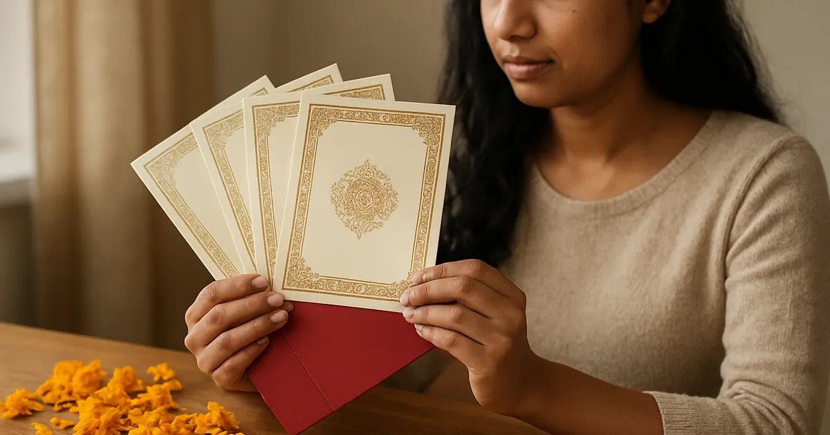
Illustration generated with AI
An invitation is printed once and read by everyone the family knows. A broken letter in a name or an odd gap in a line is easy to miss on screen and very hard to ignore on paper. This post is a proofing routine for Gujarati designs, built from the problems that come up most often.
Where do Gujarati layout problems come from?
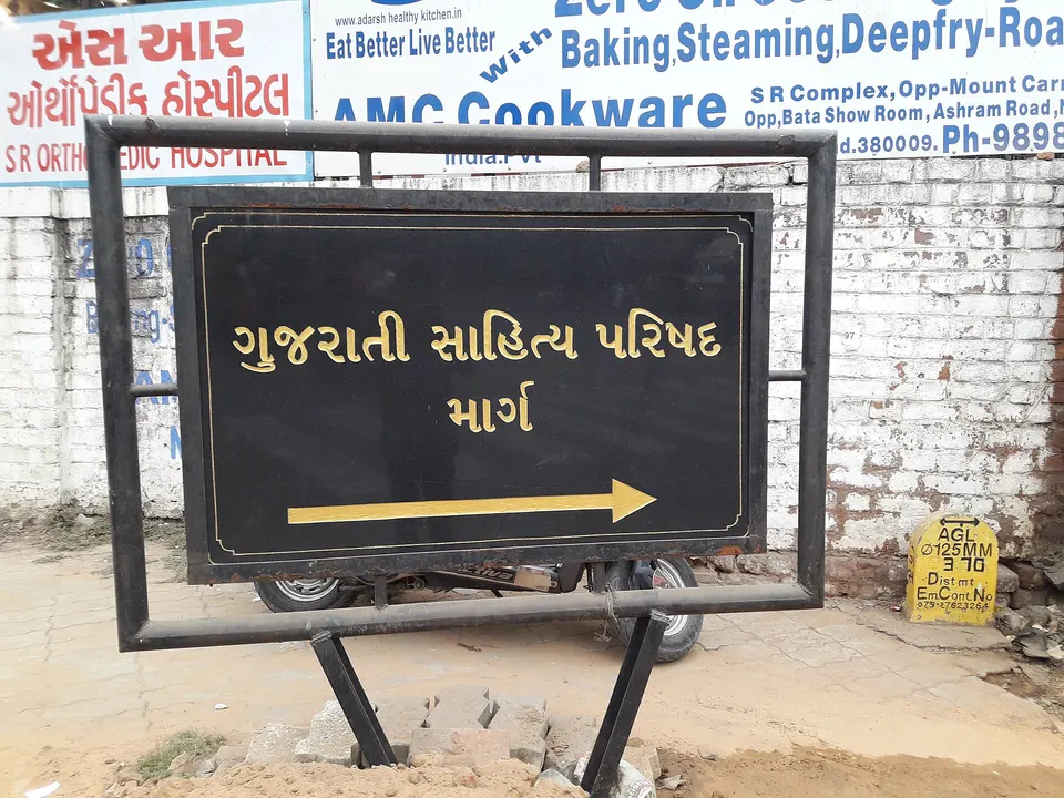
Gujarati is written with joined letters, small vowel signs above and below the line, and shapes that change depending on neighbours. Software has to place all of this correctly, and fonts differ in how well they do it. The trouble starts when text moves between apps, between encodings or between fonts. See our explanation of Unicode and the EKLG font for the background.
Problem 1: boxes, question marks or the wrong shapes
What you see: empty rectangles or unrelated English letters where Gujarati should be. Cause: the font in use does not include Gujarati, or legacy text is shown in a normal font. Fix: pick a Gujarati-capable font for Unicode text. For legacy text, install and select the matching legacy font. If you are unsure which type you have, run the text through the converter and compare.
Problem 2: broken joined letters
What you see: two letters standing separately where they should join, or a joined letter drawn wrongly. Cause: the software does not apply the font's joining rules, or the wrong characters were typed. Fix: retype the word, check the spelling in the source, and try a different font. Some design apps handle complex scripts better than others. Zoom in to 200 percent to check every conjunct.
Problem 3: vowel marks colliding with other letters
What you see: a vowel sign overlapping a letter above it, or sitting too far away. Cause: tight line spacing, or a font with small default spacing. Fix: raise the line spacing a little, and check lines with tall marks. Do not squeeze lines just to fit a layout.
Problem 4: uneven word spacing
What you see: a line with huge gaps and the next with tight words. Cause: justified text on short lines, or extra spaces typed by hand. Fix: switch to centre alignment for invitation lines, which suits short phrases. Remove double spaces. Break lines at natural phrase boundaries, not wherever the box ends.
Problem 5: mixed fonts in one line
What you see: a name in one font and the rest in another, with different heights and weights. Cause: copy-pasted text bringing its own font along. Fix: paste as plain text, then apply your chosen font to the entire block.
Problem 6: wrong names and dates
What you see: a spelling mistake in a family name, or a date written in the wrong form. Cause: the phonetic typing engine picked a plausible but wrong word, or the source was copied incorrectly. Fix: read each name from the customer's own message, and have someone confirm the final text. This is the costliest mistake of all.
A worked example: a proofing routine for a single card
- Collect the text from the customer in writing, ideally a message you can quote back.
- Type or convert it, using the phonetic tool for Unicode text or the converter for legacy fonts.
- Place it in the layout with the chosen font.
- Zoom in at 200 percent and read each line, looking at joins and signs.
- Print a test on plain paper at actual size. Screens hide spacing issues.
- Send a PDF proof to the customer and ask them, or a family elder, to read every name and date aloud.
- Get a written approval before sending to the press.
- Check the printer's proof if they provide one.
The steps take time, but a wrong name on 500 printed cards takes more.
How do you keep the layout stable?
Save a template for each card type with the fonts, sizes and spacing you have already tuned. Change the text only. Keep a note of which font each template uses and where it is installed. When you hand a file to a printer, send a PDF with fonts embedded, or outlined shapes, so that the printer's computer does not replace your font.
What should you ask the printer?
- Which format do they prefer: PDF, CorelDRAW or something else?
- Do they need fonts embedded or text converted to curves?
- What colour mode and bleed do they want?
- Will they send a proof before the full run?
A short conversation before the first job prevents repeated trouble.
A short pre-print checklist
Keep this beside your computer and tick every line before you send a file to the press.
- Every name matches the customer's written message, letter by letter.
- Dates, times and the venue are read aloud by a second person.
- The font is installed on the machine that will output the file, or embedded in the PDF.
- Zoomed to 200 percent, every joined letter and vowel sign looks right.
- No line has an odd gap, a stray space or a word cut at a bad point.
- A test print on plain paper looks balanced at real size.
- The customer has approved the final proof in writing.
When something slips through anyway, add the new problem to the list. A checklist that grows from your own mistakes is the most useful kind.
What to do next
Pick a card you designed recently and run it through the eight steps above. You may find a small issue you missed. Then write your own checklist from the steps that caught something, and tape it near your computer.
FAQs
Which font is best for Gujarati invitations? It depends on the style of the card. Choose a font with good conjunct support and test it on real wording before committing.
Can I use Canva for Gujarati? Canva handles Unicode Gujarati with suitable fonts, but always zoom in and check joins and signs.
How many people should proofread? At least two: someone who knows the family and someone with good Gujarati. Names deserve the most attention.
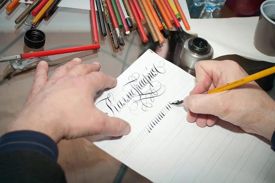
Image credits: Illustration generated with AI for Infigrow AI, Photo: Signboard of Gujarati Sahitya Parishad by Gazal world (CC BY-SA 4.0), via Wikimedia Commons, Photo: Calligraphy word by Contemporary museum of calligraphy (CC BY-SA 3.0), via Wikimedia Commons